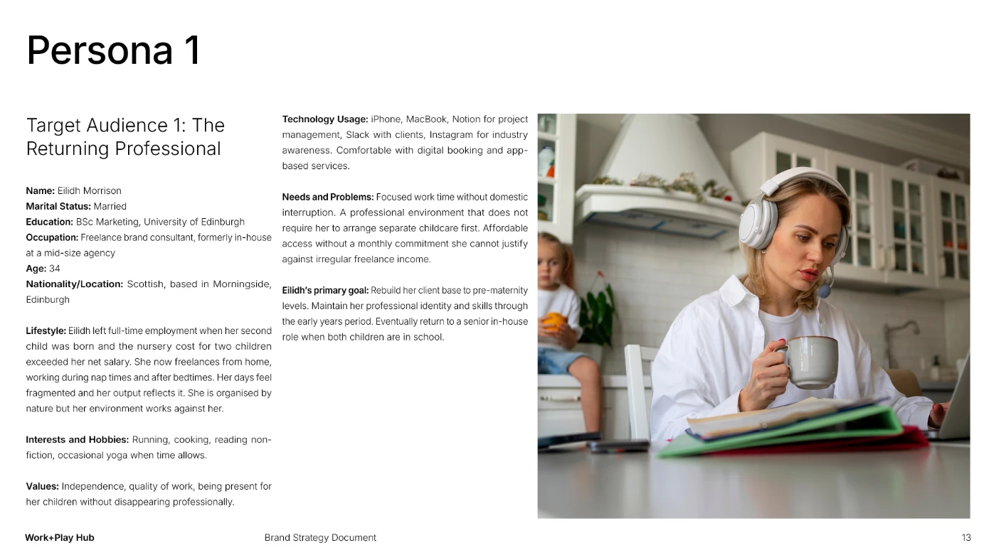
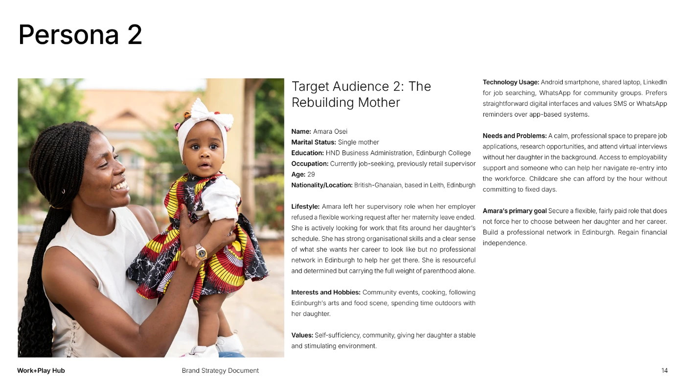
/ Overview
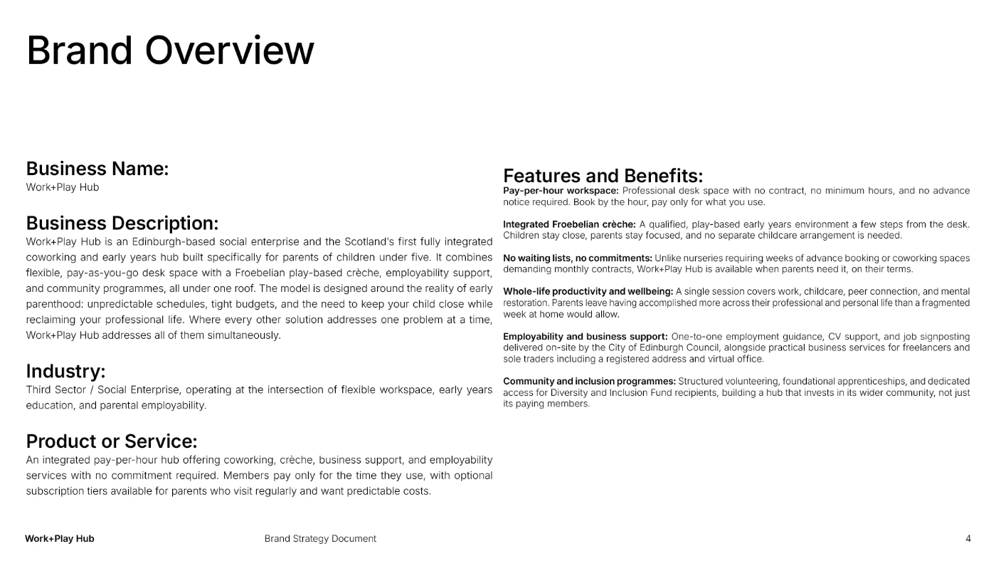
Work+Play Hub is an Edinburgh-based social enterprise and Scotland’s first fully integrated coworking and early years hub built specifically for parents of children under five. It combines flexible, pay-as-you-go desk space with a Froebelian play-based crèche, employability support, and community programmes, all under one roof.
The model is built around the reality of early parenthood: unpredictable schedules, tight budgets, and the need to keep your child close while reclaiming your professional life. Where every other solution addresses one problem at a time, Work+Play Hub addresses all of them simultaneously.
/ The Brief
Work+Play Hub was entering a defining new chapter. After an early operational phase, the organisation was transitioning to its first permanent physical location, a move that required its brand and communication to match the ambition and permanence of what it was becoming.
The brief was to build a complete brand identity from the ground up: one that could speak simultaneously to parents navigating the pressures of early parenthood, funders and institutional partners evaluating the organisation’s credibility, and a wider community audience that needed to feel the space was built for them. The brand also needed to carry a complex social mission without feeling heavy, and to scale across every touchpoint from grant applications to physical signage without losing coherence or warmth.
/ Approach
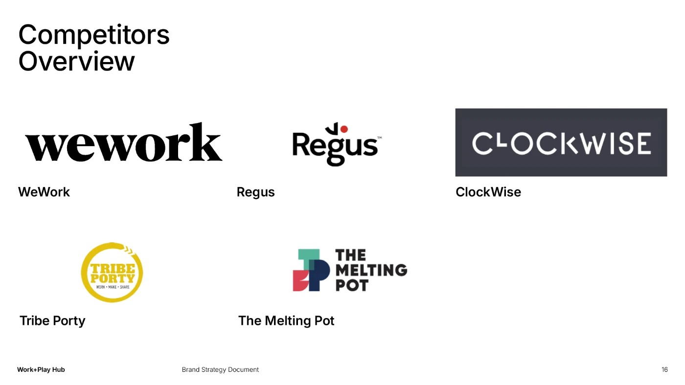
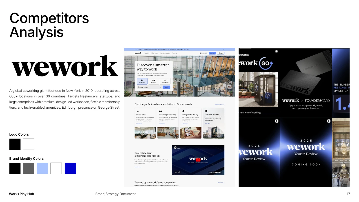
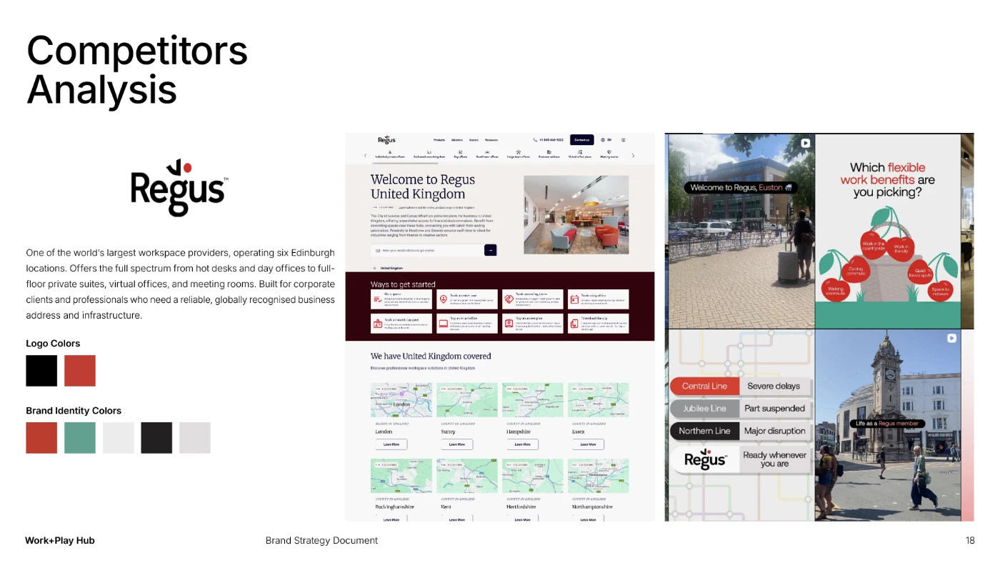
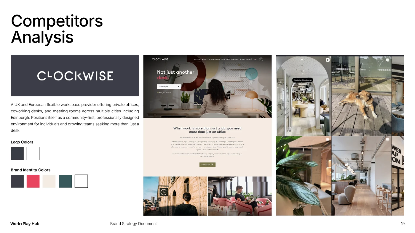
The process began with deep discovery: understanding the organisation’s mission, its founding values, and the people it was built to serve. A detailed competitor audit established where Work+Play Hub stood in a crowded landscape and identified the positioning space that was genuinely ownable.
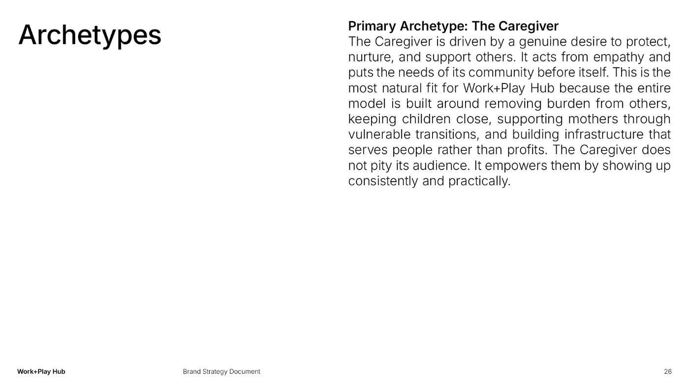
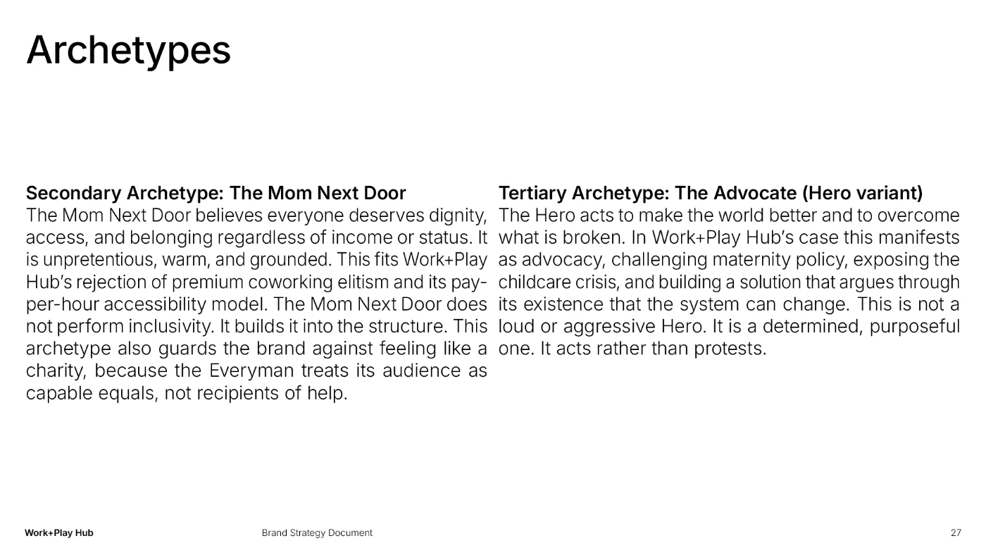
From there, the work moved into brand strategy. This included defining the brand’s personality, tone of voice, and core archetype, and developing a set of personas that reflected the real complexity of the audience: parents who are also professionals, holding two identities at once and looking for a space that honours both.
The visual identity was built to express that duality: warm and human enough to feel immediately welcoming, structured and confident enough to hold its own in institutional contexts. Every decision, from the logomark to the colour palette to the typographic system, was made in service of a brand that could flex across radically different environments without fracturing.
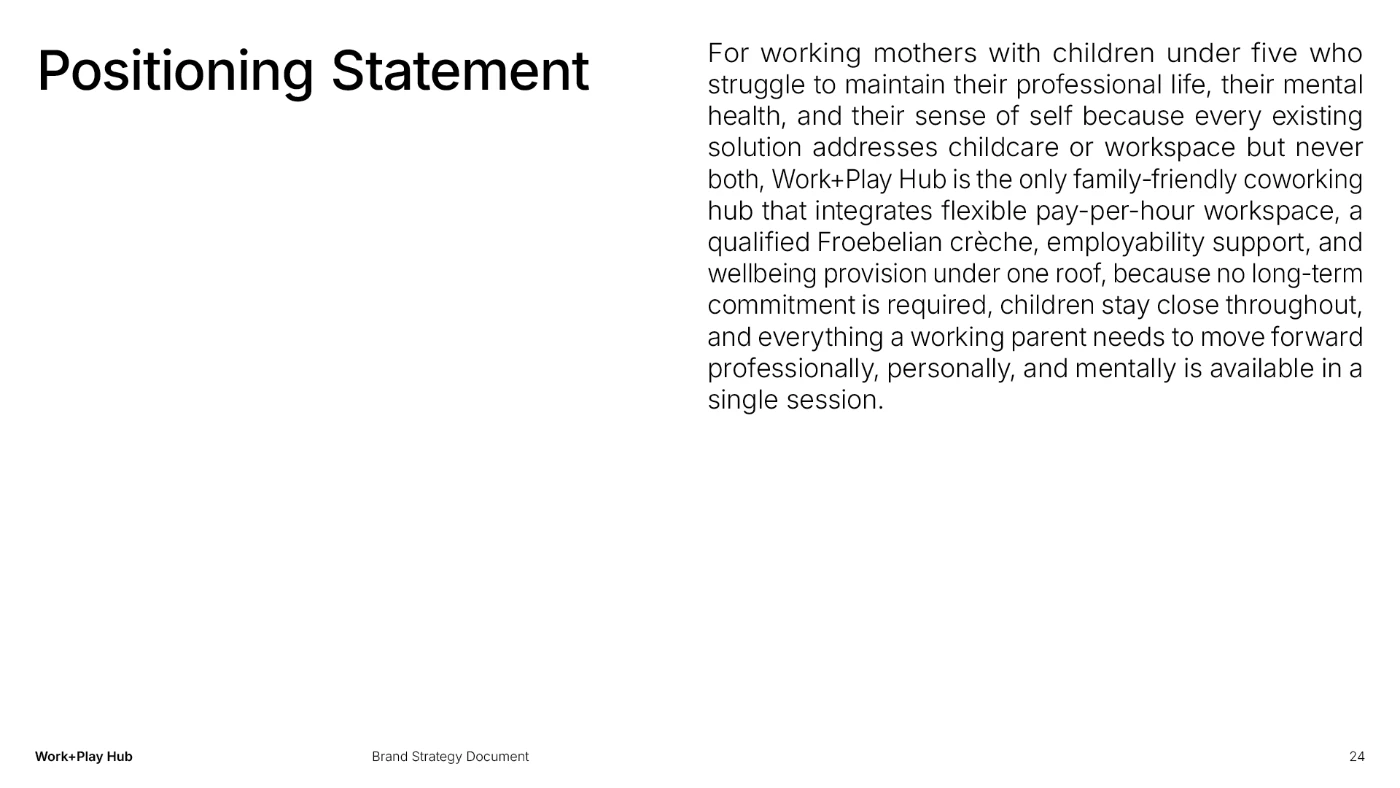
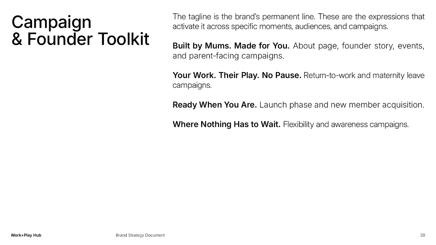
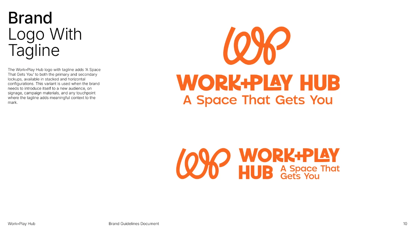
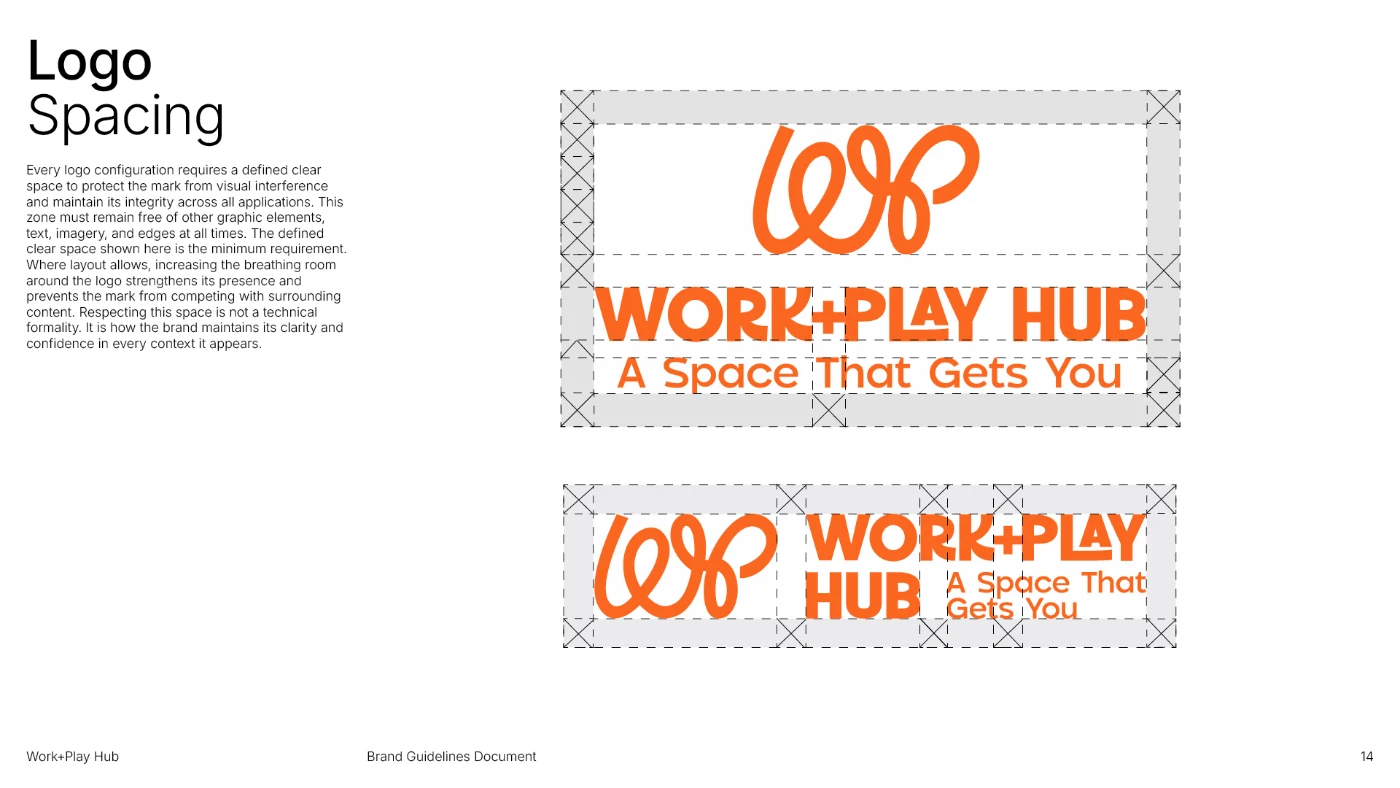
The tagline, “A Space That Gets You,” emerged from that strategic foundation. It speaks directly to the person, not the service, and captures what makes Work+Play Hub categorically different from every adjacent solution.
/ Outcome
Work+Play Hub now has a brand that matches the scale of what it is building. The identity holds together across every context it needs to operate in, from parent-facing social content to government funding reports, from a wall decal in the hub entrance to a staff lanyard. It is distinctive, coherent, and built to grow with the organisation.
The work gave Karina and her team something beyond a visual system: a clear strategic foundation they can use to make consistent decisions long after the project closed. The brand articulates who Work+Play Hub is, who it is for, and why it exists, with enough clarity that the organisation can communicate that confidently in any room it walks into.
/ Deliverables
- Brand Strategy
- Visual Identity
- Brand Guidelines
- Print and Environmental Graphics
- Stationery Suite
- Social Media Kit
- Merchandise Kit