At PicklesBucket, we love a good makeover story. There’s nothing quite like taking a tired, dusty brand and giving it the strategic visual injection it needs to dominate a market.
But let’s be crystal clear about something: Rebranding is high-stakes poker.
When it’s done right, it’s an investment that pays exponential dividends. When it’s done wrong—when it’s driven by ego, boredom, or a desperate chase after fleeting trends—it’s not just ugly design. It’s financial arson.
We aren’t just talking about hurt feelings in the comment section. We’re talking about cratering stock prices, vanishing market share, and the kind of red ink that gets C-suite executives fired.
Your visual identity is the shorthand for your company’s reputation. Mess with it at your peril.
To prove our point, we’ve pulled five of the most disastrous visual rebrands in history. These aren’t just “oopsies.” These are cautionary tales of what happens when you forget that design drives the bottom line.
1. Tropicana (2009): The $20 Million “Generic” Juice
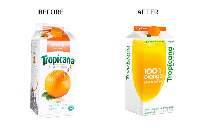
This is the textbook definition of fixing what isn’t broken.
For decades, Tropicana owned the premium juice aisle with one brilliant piece of visual real estate: an orange with a straw stuck straight into it. It communicated freshness, purity, and flavor instantly.
In 2009, they decided to “modernize.” They ditched the iconic orange-and-straw for a generic glass of juice and a bland, sans-serif font.
The Financial Fallout: The results were immediate and catastrophic. Consumers literally couldn’t find the brand on the shelves. They walked right past it, assuming it was a cheap store-brand knockoff.
- Sales dropped 20% in a single month.
- That equals roughly $20 million in lost revenue.
- Competitors like Minute Maid saw double-digit spikes in sales.
The Price of the Pivot: Tropicana paid the Arnell Group $35 million to develop the new packaging and the accompanying advertising campaign. When you add the $20 million in lost sales and the additional costs to revert the packaging and distribution, this month-long experiment cost the company over $55 million. The Branding Journal
The Reversion: Tropicana didn’t wait around. After just 30 days of hemorrhaging cash, they scrapped the new look and brought back the orange with the straw. The lesson? Never throw away your most valuable visual asset just to feel “modern.”
2. Gap (2010): The Helvetica Disaster
If Tropicana was a tragedy, Gap was a farce.
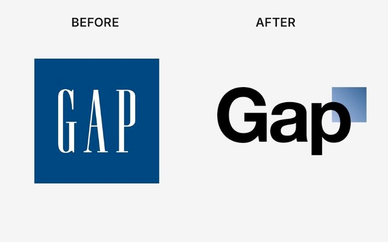
In 2010, without warning or reason, Gap replaced their iconic, elongated blue box logo—which had defined casual American style for twenty years—with… something else.
The new logo was the word “Gap” in a boring Helvetica font with a tiny, inexplicable gradient square floating near the top right corner. It looked like something an intern whipped up in Microsoft Word in five minutes.
The Financial Fallout: The backlash was instantaneous. It wasn’t just designers criticizing it; it was the general public. The internet roasted the brand mercilessly. It was a masterclass in destroying brand equity overnight.
The Price of the Pivot: While Gap never officially disclosed the exact agency fee, industry analysts estimated the total cost of the redesign, including the marketing rollout and the rapid-response reversal, at approximately $100 million. That is a nine-figure bill for a logo that lasted less than a week.
The Reversion: Gap holds the speed record for backtracking. They pulled the new logo after only 6 days, returning to the classic blue box with their tail between their legs. Startup Stash
3. X (formerly Twitter) (2023): Burning Down the Birdhouse
Elon Musk’s takeover of Twitter is perhaps the most violently disruptive rebrand in corporate history.
Twitter had something most brands would kill for: their brand name was a verb in the dictionary. “Tweeting” was universal. The friendly blue bird logo was instantly recognizable globally as a hub for news and connection.
Musk decided to light that equity on fire. He killed the bird and the “tweet” vocabulary, replacing it with a menacing, minimalist Unicode character: X.
The Financial Fallout: By abandoning the friendly, brand-safe imagery of Twitter for the dark, edgelord vibes of “X,” advertisers fled in droves.
- Estimates suggest $4 billion to $5 billion in brand value evaporated almost instantly.
- Fidelity recently marked down the valuation of the entire platform by over 70% since the acquisition. Brand Finance
The Price of the Pivot: The “X” logo itself was reportedly crowdsourced or selected for free, but the “implementation” was where the money burned. Between the legal fees for trademarking a single letter, the massive physical signage changes at headquarters, and the total loss of established brand equity, the rebrand effectively wiped out nearly $20 billion of the company’s valuation in its first year.
The Reversion: There hasn’t been one. Despite massive user nostalgia and a confused marketplace that still calls it “Twitter,” Musk has doubled down on X. This is a rare case where a company is willing to absorb billions in losses to force a new identity.
4. Jaguar (2024/2025): The “Copy Nothing” Catastrophe
Jaguar is currently in the middle of a self-inflicted identity crisis.
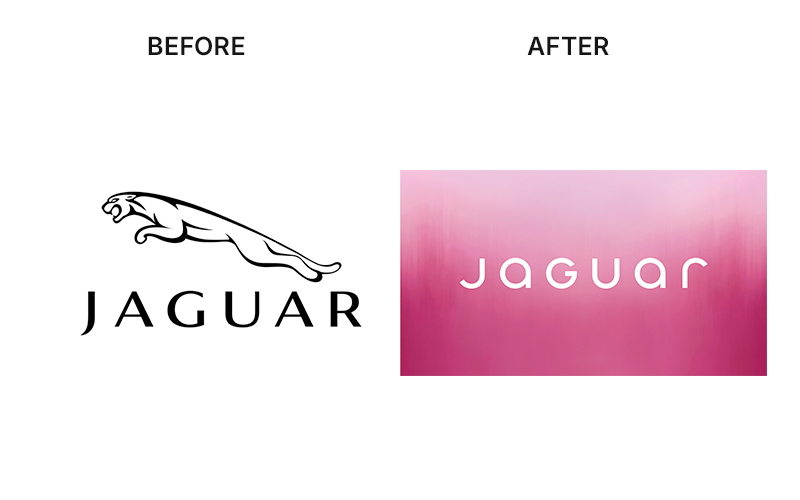
The brand is known for British heritage, racing history, and sleek design—symbolized by the famous “Leaper” hood ornament. In preparation for shifting to an all-electric future in 2026, Jaguar decided they needed a “total reset.”
They launched a rebrand that removed the leaping cat from their primary logo, replacing it with a bizarre, spaced-out, mixed-case font: “JaGUar.” The launch campaign featured models in neon art-school outfits and, crucially, zero cars.
The Financial Fallout: The campaign was widely mocked for alienating Jaguar’s actual customer base while chasing a “luxury lifestyle” demographic that doesn’t seem to exist yet.
While they are between car models right now, the immediate impact on their remaining inventory was brutal. Reports indicated Jaguar sales in Europe dropped by a staggering 97% in the month following the rebrand news, moving only a few dozen units across an entire continent.
The Price of the Pivot: The “Reimagine” strategy and the “Copy Nothing” marketing campaign carried a reported price tag of roughly $40 million. This doesn’t include the hundreds of millions in lost potential revenue as the brand effectively halted production of its old models to wait for a 2026 launch that many now fear is DOA.
The Reversion: They are sticking to their guns, betting everything on their 2026 relaunch. It’s a bold strategy: destroy the current brand to build a new one from the ashes. We’ll see if the gamble pays off.
5. Cracker Barrel (2025): The Identity Crisis
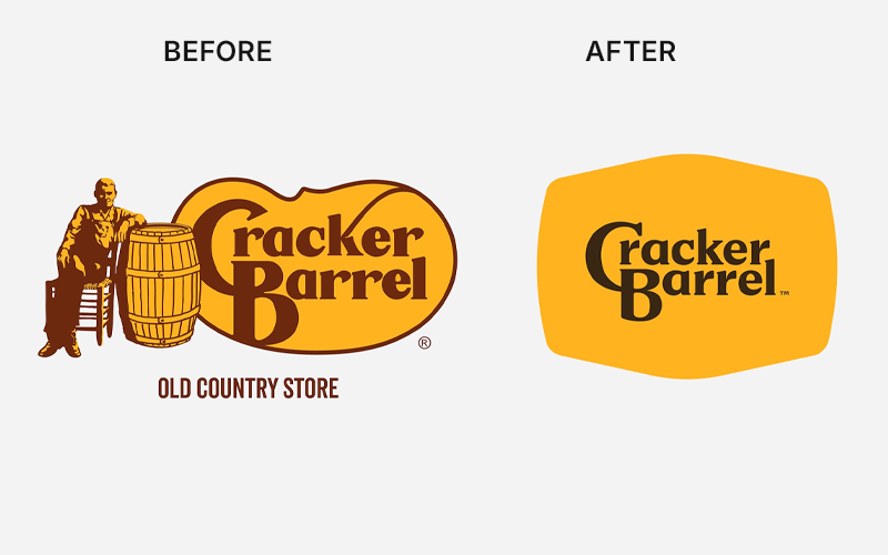
When your entire brand premise is “nostalgia and comfort,” trying to look slick and modern is a suicide mission.
Cracker Barrel recently attempted a “refresh” to appeal to younger diners. They took their beloved, cluttered logo featuring “Uncle Herschel” and a literal barrel, and stripped it down to a sterile, flat yellow wordmark.
It looked like a tech startup that sells artisanal grits.
The Financial Fallout: The core customer base—people who like rocking chairs and country-fried steak—felt betrayed. They saw the change as corporate blandness erasing Americana.
The market reacted violently. Cracker Barrel’s stock price plummeted, wiping out nearly $1.2 billion in market value in roughly a week.
The Price of the Pivot: The visual refresh was part of a larger $700 million transformation strategy aimed at modernizing the aging restaurant chain. However, the immediate investor panic and the resulting drop in foot traffic cost the company an estimated $100 million to $200 million in market capitalization in the first 48 hours following the logo reveal. Resound Creative
The Reversion: Panic set in faster than at The Gap. Recognizing they had alienated the only people keeping them in business, Cracker Barrel reverted to the original “Old Timer” logo in just 7 days.
The PicklesBucket Takeaway
These weren’t just bad artistic choices. They were bad business decisions.
Your visual identity isn’t just decoration. It’s the anchor for your customer’s trust and recognition. If you yank that anchor up without a damn good strategic reason, your ship is going to crash onto the rocks.
Don’t light your brand equity on fire in the name of “modernization.” If you’re thinking about a rebrand, you need strategy first, design second.
Ready to build a brand that makes money instead of losing it? Holler at PicklesBucket. We don’t do disasters.


